This Article Contains
Why the Whiter You Go, the More the Subject Appears to Float
There is a belief about white background photos that "the cleaner and whiter you make the background, the better." But the closer you get to pure white, the more the subject can appear to be cut out from the background and floating.
Portrait backgrounds contain the reflection of light from the location and the subtle shadows cast by the subject. These small differences in light and shadow are the information that makes the subject appear to be "standing there." Erase all of it and the person in the photo looks as if they are suspended in mid-air.
Rather than aiming for "completely white" as in ID photos, aiming for "white that remains clean while retaining a subtle gradation" — as in Apple product photography — is the approach that looks most natural for portrait backgrounds.
How "Just a Touch of Grey" Integrates with the Face
Human skin has yellow and red tones. When this color sits against a pure white (RGB 255,255,255) background, the contrast becomes too strong and the face stands out in isolation. When the background is a white that includes a hint of grey (for example, roughly RGB 240–248), that difference is softened and the face integrates with the background.
The slight remaining grey also allows the thin shadows near the subject's outline to function naturally. Hair ends do not dissolve into the background, and the line of the shoulders is preserved. Viewers feel no discomfort and their eyes move naturally toward the subject's face.
Pure white also carries the risk of blending too much with surrounding elements — the white of the screen, the white of paper, and so on. When placed on a website or in a PDF, the boundary between the background and the photo disappears, and the subject can appear to be pasted onto the page as a cutout.
FIG. 064A diagram showing the effect of background brightness on the three-dimensionality of the subject and how to choose the right shade of white.
Beware the White Shirt / Dark Hair / White Background Combination
The compatibility issue with white backgrounds is particularly acute when wearing a white shirt. When the shirt and background are close in brightness, the outline of the clothing disappears. The shape of the shoulders and arms becomes unclear, and the photo makes it hard to read the subject's build.
The fix during shooting is to use a slightly grey background, or to reduce the background lighting a little so the background alone is slightly darker (a grey-leaning white). If you want to wear a white shirt, tell the photographer in advance so they can adjust the background brightness.
Dark hair against a white background creates a different problem. When cropping is performed, fine hair ends and loose strands can end up processed as straight lines. Always check after cropping to ensure the outline does not look unnatural.
What Happens When You Over-Crop
Cropping is the process of selecting the background and replacing it with white or transparent. The cleaner the crop, the better it might seem — but the more precise the crop, the more the natural information at the very edge of the outline is also lost.
The areas most affected are hair ends, bangs, and fine facial hair. Fine strands blend with the background, so cropping makes the ends appear to be cut off in a straight line. Similarly, areas near the shoulder and ear outlines that looked soft in the original — softened by the influence of the background color — can look hard after cropping.
When requesting a crop, communicating "please keep the hair ends looking natural" and "please process the shoulder outline softly" changes the result. In some cases, it looks more natural to use the photo as-is with the background tidied to white, rather than performing a full cutout crop.
A white background keeps just enough gradation for the subject to stand in front of it — rather than eliminating it to pure white.
How to Check After the Shoot and After Delivery
Before shooting, confirm where the white background photo will actually be used. Profile pages on websites and PDF documents have different surrounding background colors. If the display surface is roughly white, a photo with a slightly grey-tinted white will be easier to use.
During the shoot, in addition to a fully white background, also get shots with a light grey or a slight remaining shadow. Keeping a few variations allows you to choose the right one for each use case later.
After delivery, check by placing the photo in the actual display environment. When placed on the page in a web browser, check whether the boundaries at the hair, shoulders, and white clothing look natural. If the subject does not appear as if they have been suddenly cut out and pasted in, but rather as if they are standing there, the white background is working properly.
- A white background with a slight hint of grey integrates better with the subject than pure white. The thin shadows in the background support three-dimensionality.
- A white shirt and white background can cause clothing outlines to disappear; dark hair cropping can make hair ends appear straight — both require attention.
- Check the final result not only when zoomed in but also at the actual display size and in the actual display environment.
Related Diagrams
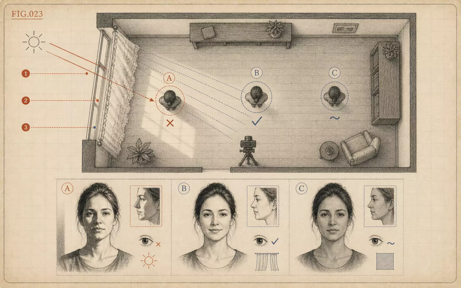 FIG.023Where to Stand Near a Window in Direct SunlightNear a window, softening the direct sunlight matters more than brightness. Use a sheer curtain or fabric to turn the window into a large, soft light source.
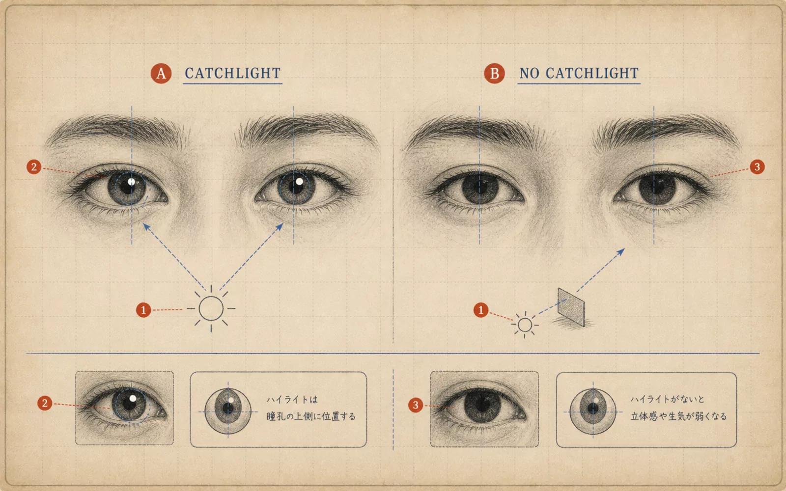 FIG.061Is There Light in Your Eyes?The final step in photo selection is checking the light in the pupils. Photos with small white highlights in both pupils convey a sense of life.
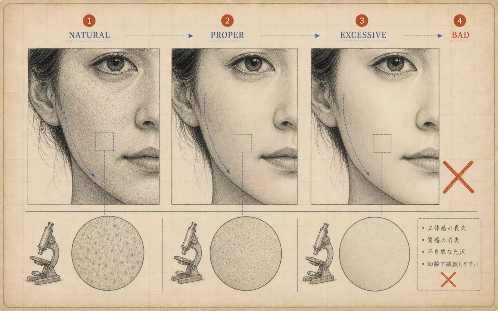 FIG.063The Plastic Skin TrapSmoothing out every bit of skin texture makes people disappear from the photo. Use a three-level approach: remove, reduce, or retain.