This Article Contains
The Premise: You Are Seen on the Announcement Page First
A conference photo is seen first on the announcement page — before you actually speak at the venue. Viewers look at the photo in the context of "do I want to hear this person speak?" More than the impression of the face alone, what matters is whether the photo conveys "the composure of someone who stands on stage."
On announcement pages, the photo is placed alongside the name, title, and theme. When the face is angled toward the text, the viewer's eye naturally moves from the photo to the written content. When the face is angled outward, the gaze tends to escape to the outside of the page.
This photo is not viewed in isolation — it is a piece of material that functions alongside surrounding text. Setting up the face direction and margin with that premise in mind is the foundation of a good conference photo.
An Expression That Makes People Want to Hear You Speak
Leaning too far toward friendliness can make you appear lightweight in a context where you are speaking as an expert. Leaning too far toward formality creates an impression of being difficult to approach or talk to. In either extreme, the impression tilts toward either "looks difficult" or "seems unreliable," rather than "I want to listen."
A useful reference is "the expression from the moment just before you begin speaking." Eyes that are steady and stable, a mouth that is slightly soft, and shoulders that are not raised too high. Not a strong smile and not a blank face — a slightly composed, settled expression in between tends to suit the context of a conference.
Trying too hard to create a strong expression puts tension in the body, and that tension shows in the photo. By settling your posture first (see FIG.028) and then letting the expression follow, a natural state is more likely to emerge.
FIG. 131An educational diagram for thinking about stage composure and announcement-ready margin in conference speaker photos.
Creating a Face Direction and Margin That Guide the Eye Toward the Text
If the photo will be placed on the left side of an announcement page, a shot where the face is angled inward (facing right) will be easier to use. When the face is angled toward the direction of the text, the viewer's eye naturally moves in the sequence of "face → text" (see FIG.040).
During the shoot, keep three variations: front-facing, angled right, and angled left. For each direction, select shots where the gaze is not too strong and the expression is composed. Tell the photographer in advance: "I'd also like shots with left and right margin since I want to use these for announcement banners," and they can accommodate a landscape layout.
Margin is not decoration — it is space to place text. Keeping cuts with margin on both sides of the face makes it easier for the organizer to arrange the name, date, and time.
What Is Missing When You Use a Business Card Photo
Business card photos often feature a close bust-up with the face shown large. When used on announcement pages or banners, there is not enough space to place text. For landscape banners in particular, an oversized face will leave no room for dates or venue names.
Another issue is a smile that is too strong. Friendliness matters for business cards, but conference announcements also require composure. When only the cheerful impression comes through, it can feel mismatched with the context of an expert speaking engagement.
Even within the same shoot, keeping candidates for business cards and conference announcements separate allows you to select the best shot for each purpose.
A conference photo retains margin and composure so the eye flows toward the text.
Checks Before, During, and After the Shoot
Before the shoot, confirm where the photos will be used: announcement pages, flyers, or social media banners. If you plan to use them in landscape format, keep wider margin on both sides of the face. If you also expect portrait format (business cards, email signatures), keep separate cuts with margin in the vertical direction as well.
During the shoot, capture three variations: front-facing, angled right, and angled left. For each direction, aim for an expression like the moment just before you begin speaking — gaze not too strong. Telling the photographer in advance "please shoot three patterns" makes switching smoother.
When selecting photos, try placing the photo next to the name and title to see how it looks. Keep the shot where the face does not go dark even when small, and where it can be read alongside text. Finally, confirm that the direction and margin suit the intended use case.
- Conference photos should have their face direction and margin set up with the assumption that they will be used small in announcement materials.
- Composure befitting someone who speaks on stage is needed, not just friendliness. Use "the moment just before you begin speaking" as a reference for expression.
- Keeping patterns in front-facing, angled right, angled left, and with margin makes the photos easier to use in announcements.
Related Diagrams
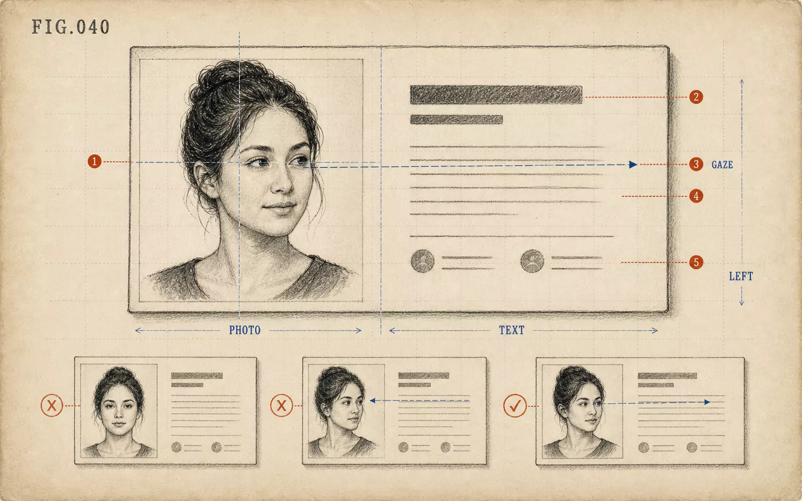 FIG.040On LinkedIn and Business Cards, the Face Goes on the "Left"On the web and on business cards, face photos tend to be placed on the left, making photos where the face is angled inward easier to use.
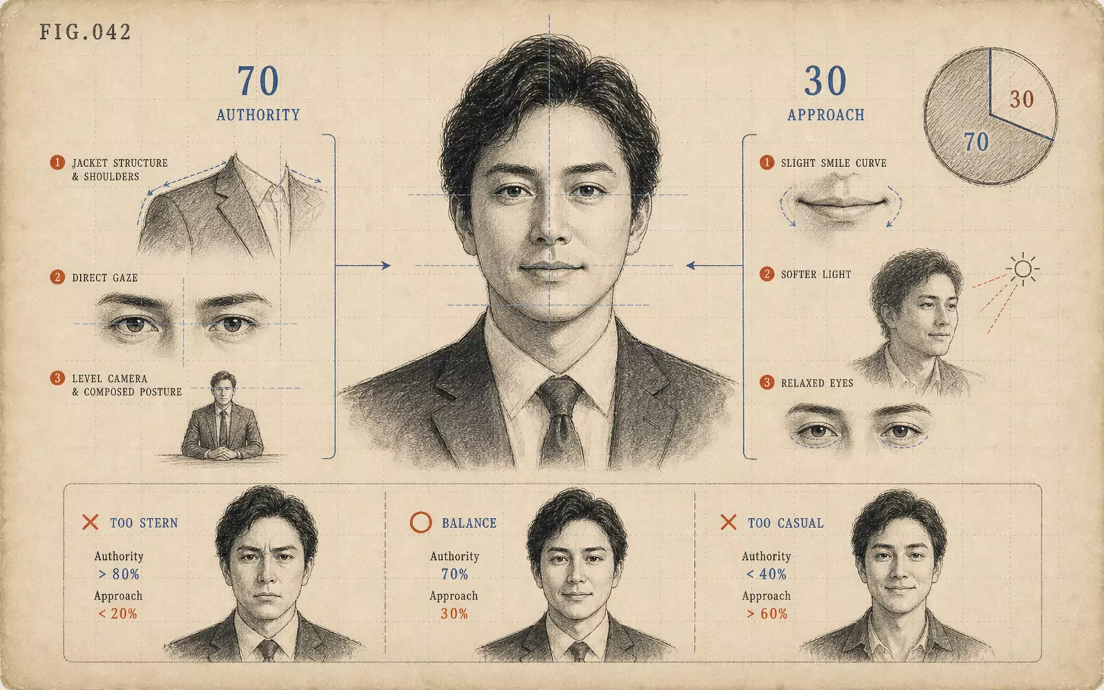 FIG.042Executive Photos: 70% Authority, 30% ApproachabilityExecutive photos build authority through clothing and add approachability through expression. The ratio of 70% authority to 30% approachability is the standard.
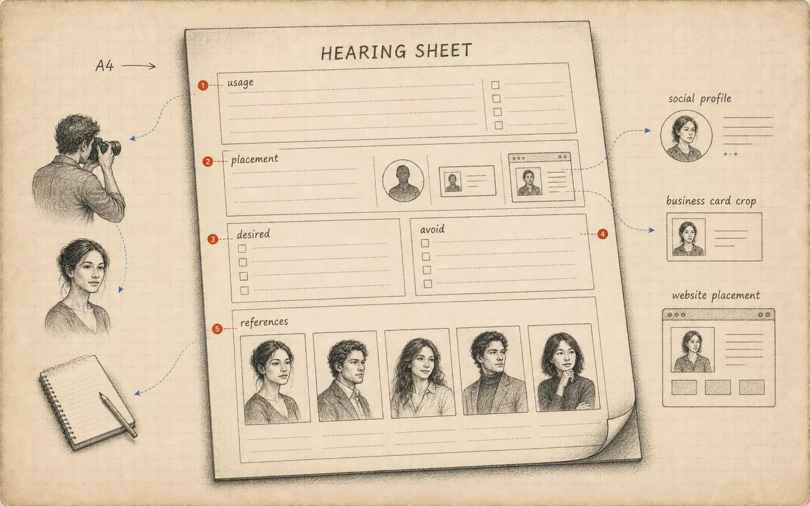 FIG.084Bring Your Own Briefing SheetBringing a one-page summary of intended use, target viewer, and desired impression from the subject's side aligns the shoot's direction.