This Article Contains
The Author Portrait Works Alongside Text
An author portrait has the role of quietly conveying the presence of the person who wrote the work without damaging the impression of the work or text itself. It is not a standalone photo — it is material that functions alongside text, headings, and titles.
An author portrait placed in a book's flap is where readers confirm "this is who wrote it" after finishing the book. In a web article, it is placed at the beginning or end of the body text and seen when readers become curious about the author. In both contexts, the photo is expected to "not get in the way" rather than "stand out."
Therefore, the standard for selecting an author portrait is not "I like this photo" but "when placed next to the text, is the main content easy to read?"
How Face Direction Changes the Way Text Is Read
Face direction is an important editorial consideration. When a photo is placed on the left, a face angled inward (toward the right) causes the reader's eye to flow naturally from the face to the text (see FIG.040). When the face is angled outward, the gaze tends to escape off the page, and the reader's attention moves more easily away from the text.
This effect works at such a natural level that it is invisible, like a proof photo you wouldn't notice. Readers don't consciously think "easy to read" or "hard to read" — they simply feel whether or not they are drawn toward the text.
Keeping multiple face directions means you can accommodate both vertical and horizontal Japanese text in a book, and whichever side of a web article the photo is placed on. It also makes it easier for editors to adjust placement when needed.
FIG. 133An educational diagram for thinking about the author portrait as a photo that works alongside text.
Choosing a Shot That Does Not Disrupt the Text Alongside It
There are three conditions for a photo that functions as an author portrait. First: the gaze is steady and composed. Second: the background is simple and the face is easy to read. Third: the expression is not too strong, and the viewer can return their focus to the text.
For gaze, keeping not just shots looking at the camera but also shots looking slightly sideways or slightly downward makes selection easier (see FIG.018). An expression that suggests thoughtfulness or the quiet after writing can sometimes be more useful as an author portrait.
During the shoot, keep cuts in front-facing, angled right, angled left, and with margin. When handing the photos to a publisher or editor, noting "margin available for easy cropping" makes them more practical. Leave margin around the face so it can be cropped into portrait, square, or landscape formats.
What Happens When You Pack In Too Much "Author-ness"
A common mistake is choosing the photo that stands out most on its own. For an author portrait, supporting the credibility of the text matters more than standing out. The photo you like most personally and the photo that functions next to the text are often not the same one.
Packing in too much "author-ness" through backgrounds or props is also a problem. A photo stuffed with bookshelves, or one where the atmosphere of a study is too strong, carries too much information alongside the text. The reader's eye goes to the background rather than the face, and concentration on the main text is easily broken.
An author portrait is a photo that "quietly signals" the author's presence. Choose a shot that does not assert too much presence and functions as a complement to the main text.
An author portrait is not a standalone shot — it is chosen as material that works alongside text.
Checks Before, During, and After the Shoot
Before the shoot, imagine the places where the photo will be used: book jacket flaps, web articles, or speaker profile pages. Leave margin around the face so it can be cropped into portrait, square, or landscape formats. If you receive specifications from a publisher, confirm the size, aspect ratio, and resolution in advance.
During the shoot, alternate between gazing at the camera, slightly to the side, and slightly downward. Select shots where the expression is composed and not over-engineered. If you are an author who needs a thoughtful atmosphere, not limiting yourself to direct eye contact will make selection easier.
When selecting photos, try placing them next to the main text or profile copy to see how they look. Choose a shot where the author's presence comes through without appearing stronger than the text. If you can confirm that the face is readable even at small size and can be read alongside the text, that photo functions as an author portrait.
- Think of the author portrait as editorial material placed next to text. Choose a shot that supports the text's credibility rather than one that stands out.
- Face direction and retained margin make the photo connect with the main text. Keep patterns in front-facing, angled right, and angled left.
- Packing in too much through backgrounds or props scatters information alongside the text. Simple is the baseline.
Related Diagrams
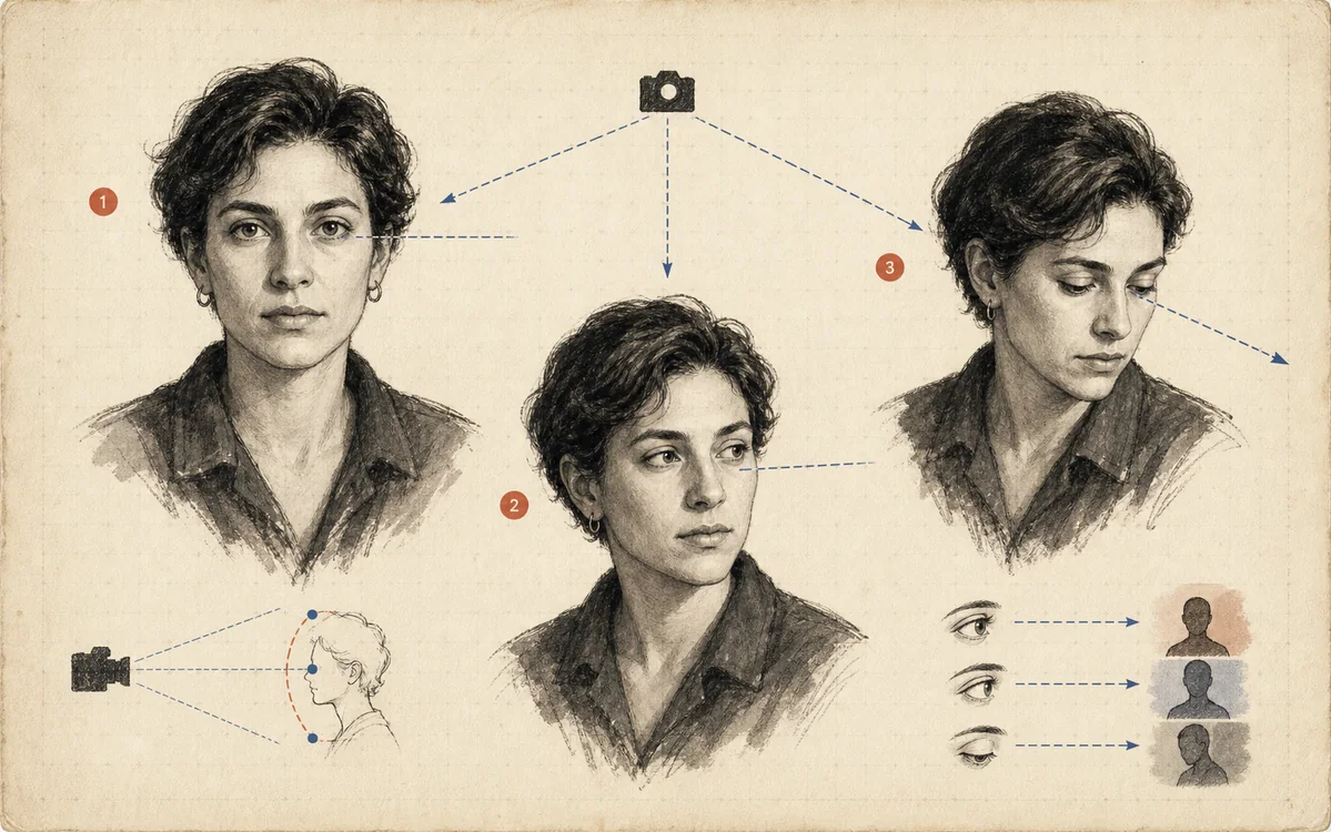 FIG.018Gaze in Three Directions Changes the CharacterLooking at the camera, looking away, and looking slightly upward each create trust, thoughtfulness, and a sense of the future, respectively.
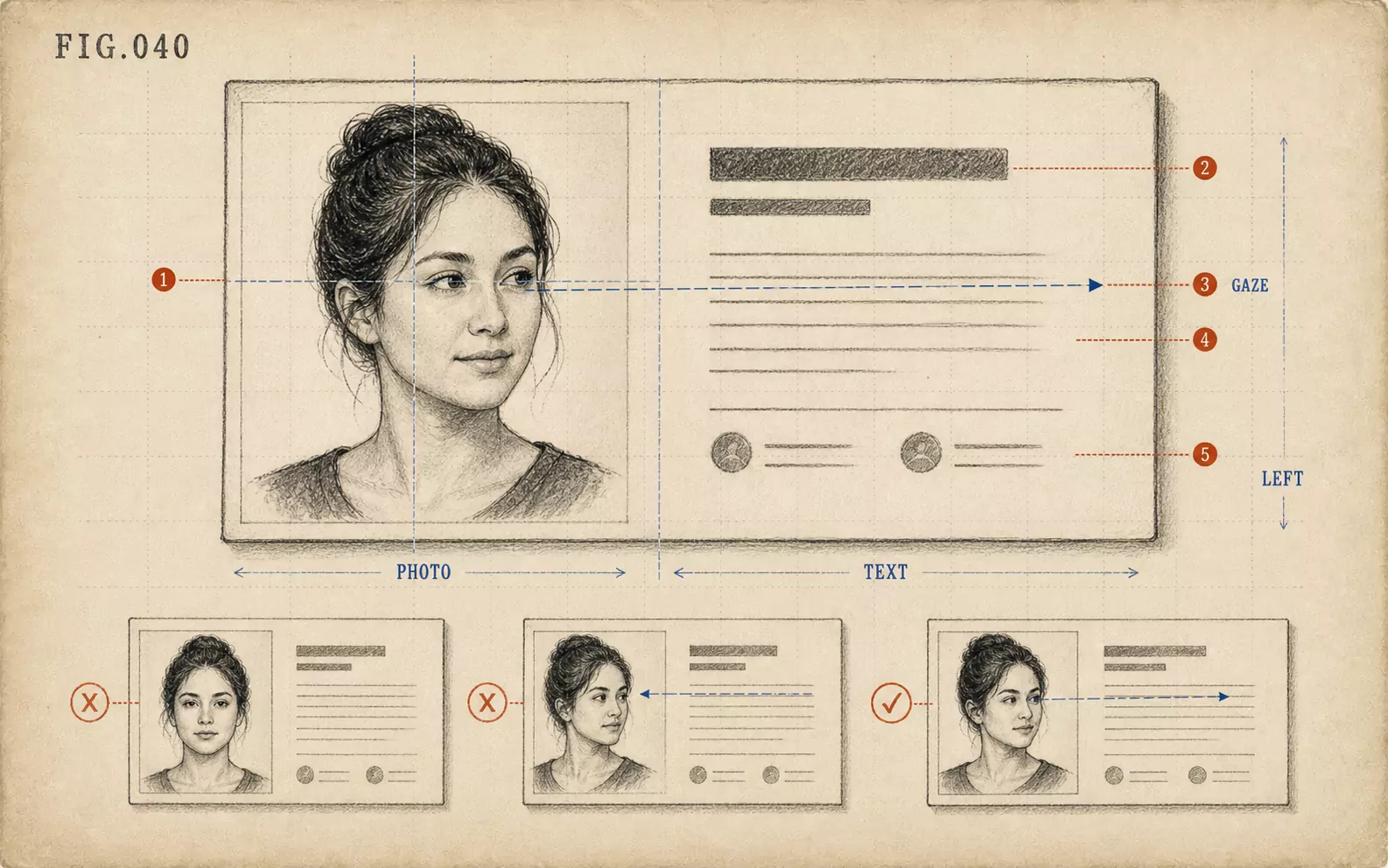 FIG.040On LinkedIn and Business Cards, the Face Goes on the "Left"On the web and on business cards, face photos tend to be placed on the left, making photos where the face is angled inward easier to use.
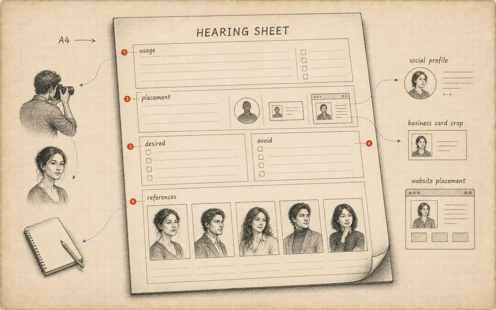 FIG.084Bring Your Own Briefing SheetBringing a one-page summary of intended use, target viewer, and desired impression from the subject's side aligns the shoot's direction.