This Article Contains
Think of SNS Icons with "Small and Round" as the Premise
SNS icons appear in a small circle alongside posts and comments. On smartphone screens, the diameter can often be as small as 30–50 pixels, and clothing patterns, background atmosphere, and overall silhouette are barely readable.
What viewers receive is: a bright face, the impression of the eyes, and the facial outline — these three things. Dark face, a background with many colors or patterns, a face that is too small — when these conditions combine, the icon becomes one where no one knows who it is.
Choosing "a shot I like" as a profile photo and choosing "a shot that functions" as an icon are two different decisions. For an icon, a check based on this premise of small circular display is necessary.
What Gets Read on Each Platform
On X, icons are displayed small alongside text. In an environment where the timeline is scrolled quickly, high visibility — where the face is bright and the outline is easy to read — matters. Being recognizable in an instant in an information-dense screen is required.
Instagram has multiple display locations: feed posts, Stories, and the profile page. Photos that convey atmosphere, brand image, and a sense of the world make it easier to build a relationship with followers.
TikTok is a platform where the video impression is strong. Icons that convey a sense of energy or approachability tend to be read more easily. Smiling and natural expressions can sometimes fit better here than on other platforms.
Common across all platforms is that the face and eyes are identifiable when cropped small and round. Check whether this basic condition is met before worrying about the subtle differences between platforms.
FIG. 135An educational diagram for thinking about how an SNS icon will look when cropped small and round.
Conditions for a Photo That Remains Readable When Cropped Round
There are three conditions for a photo that functions as an icon. First: the face is bright. Second: there are catchlights (small highlights) in the eyes. Third: the background does not distract from the face.
For facial brightness, a photo that feels "maybe a little too bright" at original size tends to look just right when displayed small. Photos that are dark at full size tend to sink even darker when reduced (see FIG.061).
For the background, having a slightly different color from the hair and clothing makes the outline easier to read. Too white and the face floats; too dark and the face sinks. A gray-toned or light-toned background tends to work with most skin tones.
For margin, leave enough so that the forehead and chin are not cut off when cropped into a circle. When the face is placed too centrally, it can look cramped when cropped. A composition where the shoulders and above are centered is the baseline.
What Happens When You Use a Full-Body or Atmosphere-Heavy Photo as an Icon
Trying to use a full-body photo or a photo with a great background atmosphere directly as an icon is a common mistake. When reduced to icon size, the face becomes unreadable and it becomes difficult to tell whose post it is. Even if you love a particular location or atmosphere, cropping to a circle can push the face to the side.
Using a photo with a dark face causes the same problem. Even if it looks good on the full screen, in a round icon the eyes sink and the expression becomes difficult to read. This is a lighting issue at the time of shooting (see FIG.024), and cannot always be corrected with brightness adjustment alone.
Shooting a dedicated cut specifically for the icon is the most reliable approach. However, within a properly organized shoot, if you keep cuts where "the face is bright, the background is simple, and the shoulders and above are visible," those will function directly as icons.
Judge an SNS icon by whether it is readable in its small, round display state.
Checks Before, During, and After the Shoot
Before the shoot, decide on the primary SNS you will use. If unsure, use a bright face, simple background, and visible shoulders and above as the baseline. If you want to also capture an icon-ready cut during the shoot, tell the photographer in advance: "Please also take a cut with margin that can be cropped to a square."
During the shoot, leave margin with the assumption that it will be cropped to a square. Check the catchlights, background color, and the boundary between hair and background on the monitor. For face direction, front-facing or a slight angle is most usable. Turning too far to the side causes the face to shift to one side when cropped small and round.
When selecting photos, actually crop to a circle and check on a smartphone. Even if a photo looks great on a computer screen, the impression can change on a small smartphone display. Keep shots where the face, eyes, and outline are identifiable even when small.
- SNS icons should be selected with the premise that they will be displayed small and round. Facial brightness, catchlights, and a simple background are the top priorities.
- X prioritizes visibility; Instagram prioritizes atmosphere; TikTok prioritizes approachability. But the basic conditions come first.
- Use photos where the face and eyes are identifiable even when cropped small and round. Full-body and atmosphere-heavy photos are not suited for icons.
Related Diagrams
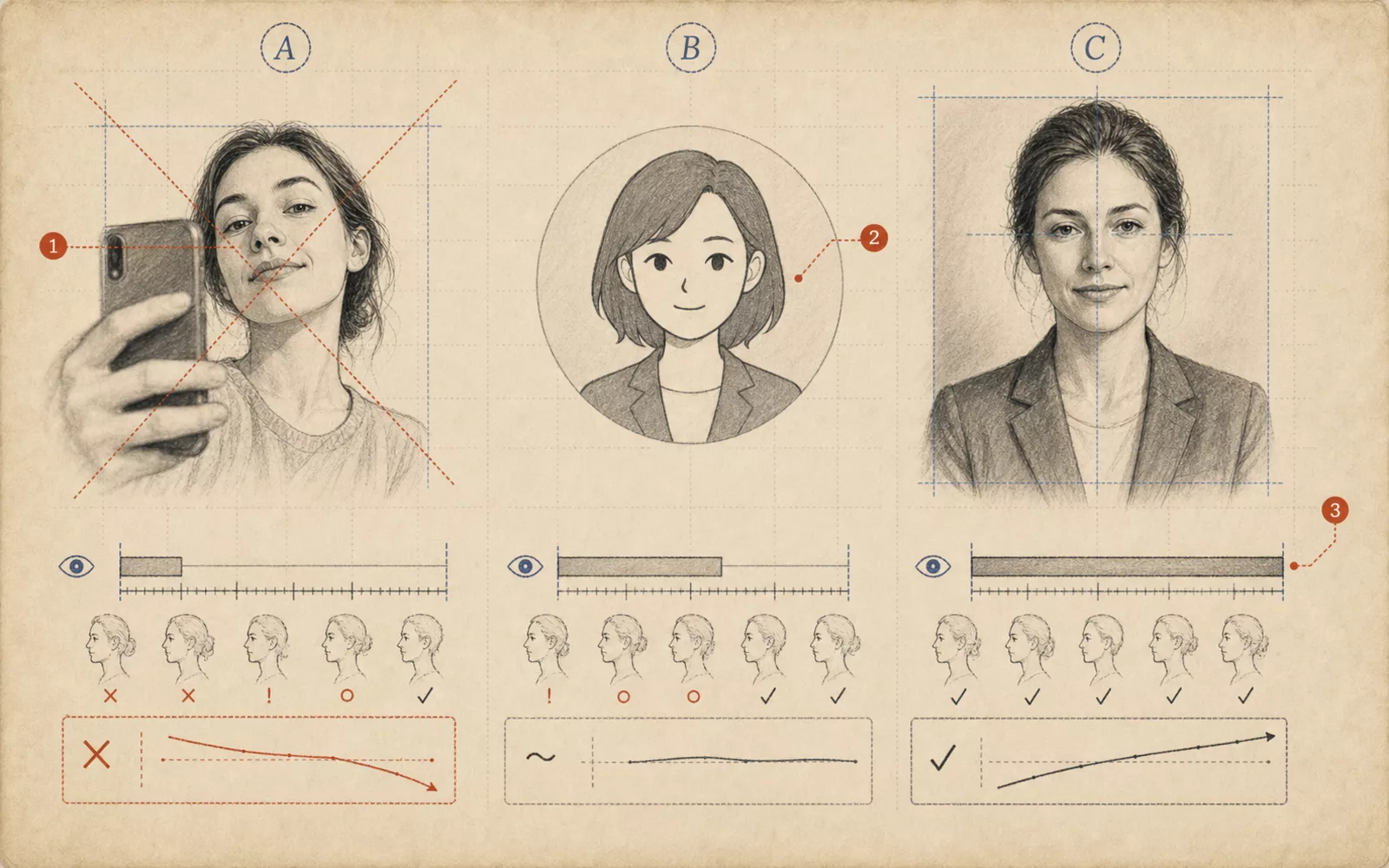 FIG.004Selfies, Illustrations, and Professional Shoots: How Does Trust Change?Selfies, illustrations, and professional shoots differ in the sense of presence and trust they convey. Organize your choices based on intended use.
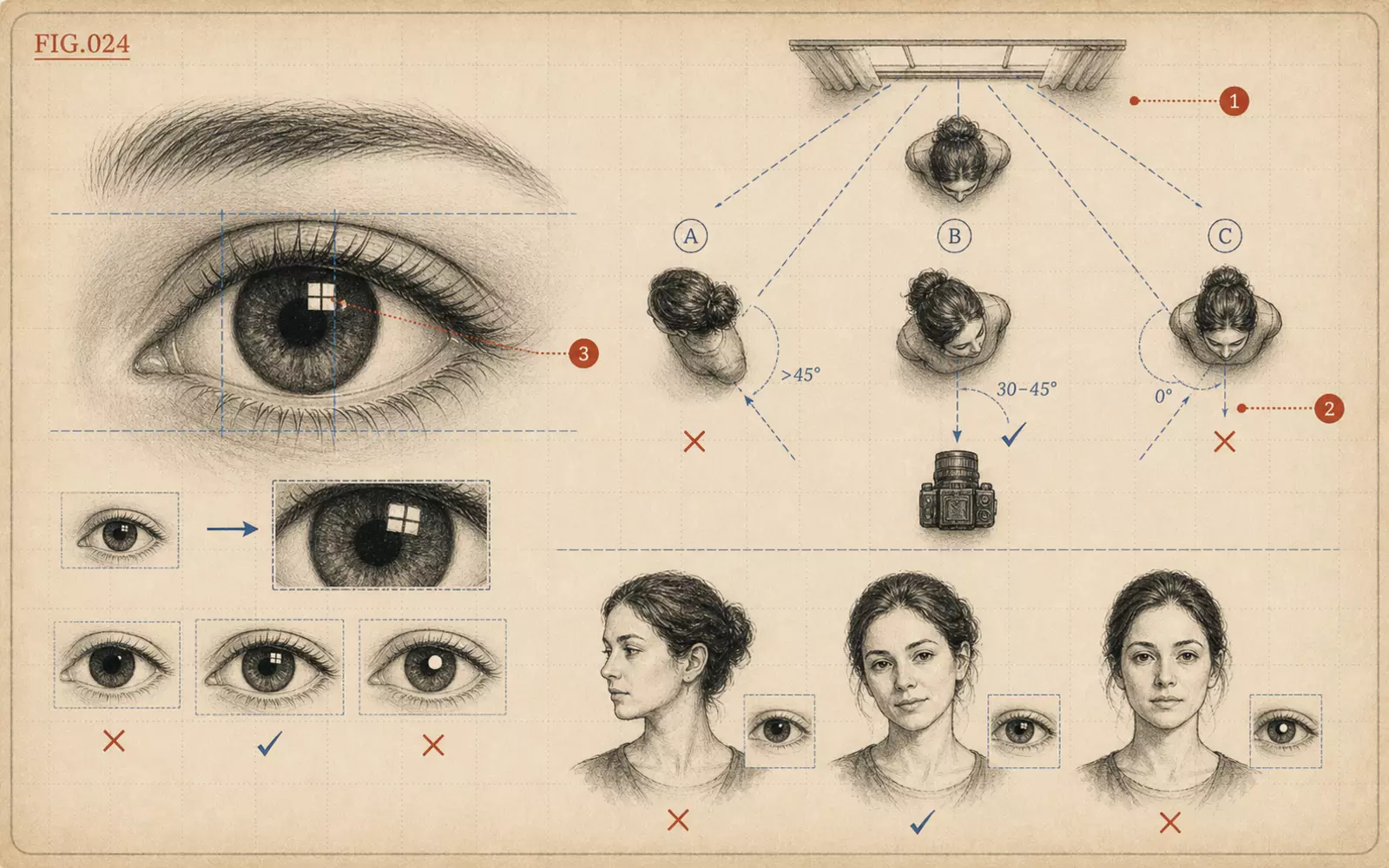 FIG.024How to Angle Your Body to Get Catchlights in the EyesCatchlights are small highlights that appear in the pupils. Angling not just the face but the chest toward the light makes them more likely to appear.
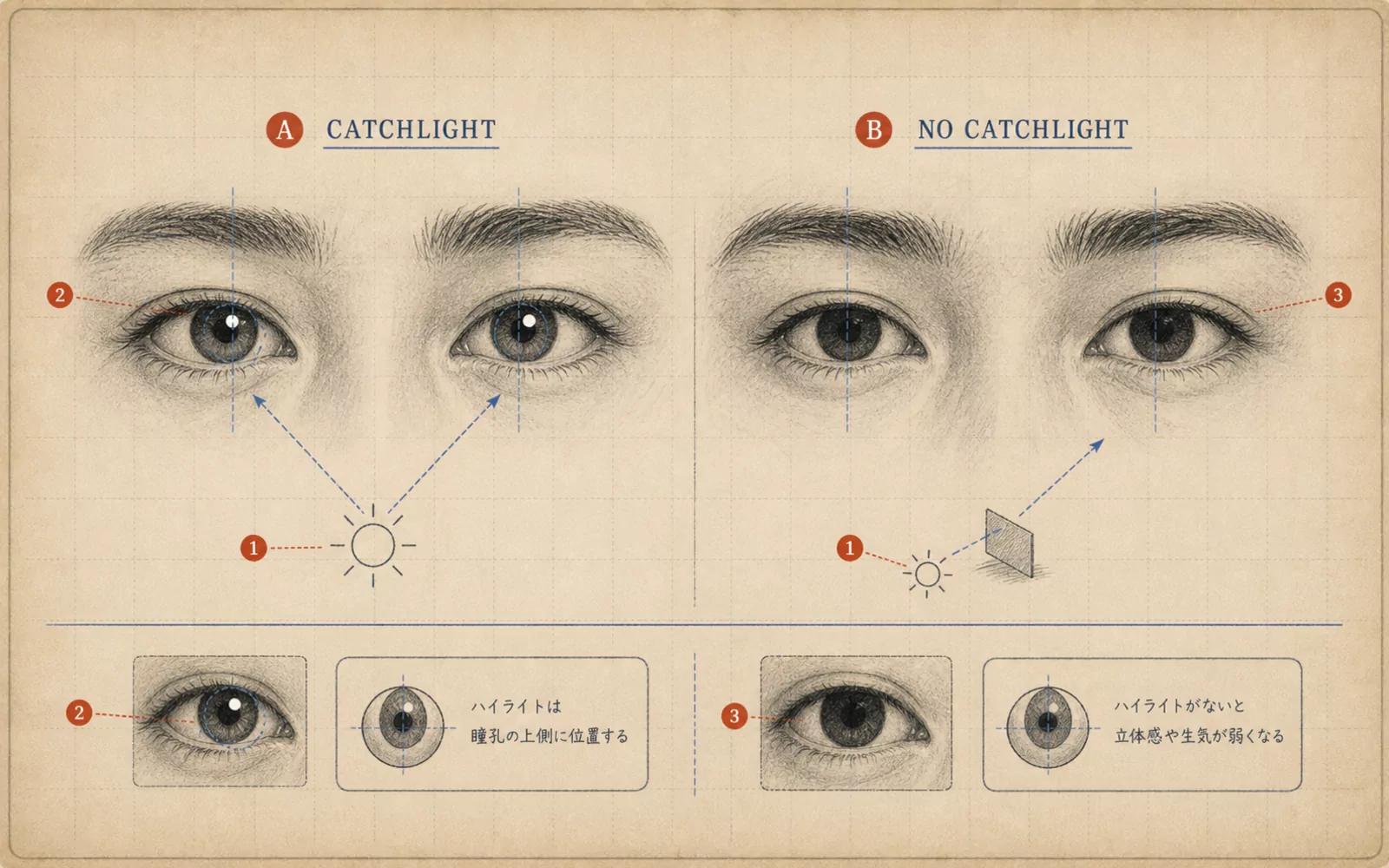 FIG.061Is There Light in the Eyes?The final step in photo selection is looking at the light in the pupils. Photos with a small white highlight in each pupil convey vitality.