This Article Contains
TV, Web, and Banners Each Crop the Photo Differently
A photo used for a media appearance is cropped into a different shape depending on where it is used. Where TV chyrons overlap, the aspect ratio of a web article thumbnail, the landscape layout of an announcement banner — the required margin and face direction differs for each.
It is rare for a single photo to work for every use case. Selecting only "the one shot that turned out best" tends to create situations where the photo cannot be used for certain placements. The practical approach is to retain multiple patterns from the shoot itself.
Creating a state where the organizer or media coordinator can easily process the photo after receiving it is also a consideration that reflects well on the person appearing in the media.
What Gets Placed Around the Photo for Each Outlet
For TV, a title or chyron text appears in the lower portion of the screen. Confirm the position of the face and the margin so the impression does not break down even when text overlaps with the face area below.
For web articles, the thumbnail shifts between landscape and portrait depending on the relationship with the article title and body text. Margin that can accommodate both orientations makes the photo easier for the coordinator to process. For announcement banners, dates, venue names, and themes are arranged horizontally alongside the photo, so a face that is too large leaves no room for text placement (see FIG.040).
In addition, when a cutout of only the person is needed, photos where the outlines of hair, shoulders, and clothing are clearly separated from the background are easier to work with. Choosing light and clothing color that creates a visible boundary against the background is something to confirm at the shoot.
FIG. 134An educational diagram for thinking about how media appearance photos are cropped differently by outlet.
Why You Should Keep Multiple Patterns: Front, Left and Right, and With Margin
Keeping four patterns — front-facing, angled right, angled left, and with margin — makes the photos usable for both TV and the web. For every pattern, align the brightness of the face and the light in the eyes.
The reason to keep multiple directions is to match the layout of each outlet. When the face is angled toward the text, the reader's gaze naturally flows from the face to the information. A layout with text on the right works with a right-facing shot; a layout with text on the left works with a left-facing one.
At the shoot, tell the photographer in advance: "Please also shoot a landscape shot with margin for banners." Even a short note makes it much easier for the photographer to adjust the composition. Use "some space around the face" as a rough guideline for margin.
What Goes Wrong When You Commit to a Single Favorite
Selecting only a single close-up favorite for delivery is a common mistake. Even if it works for a web article, there may not be enough room to place text in a landscape banner. Checking in portrait, square, and landscape crops reveals where a single shot falls short.
Having the background and clothing color too similar is also a problem. When cutting out the person, the outline becomes difficult to distinguish, and the result tends to look rough. Confirming before the shoot that "cutout processing might be needed" can inform your choices of background and clothing.
Choosing a shot that looks good and choosing a shot that is practical are two different decisions. The fundamental principle of photo selection is to confirm at the actual placement where the photo will end up.
Media photos should not be limited to one shot — prepare for the different ways each outlet will crop them.
Checks Before, During, and After the Shoot
Before the shoot, list out the possible uses: TV appearance, web article, event announcement, social media announcement. The more uses you have, the more you should retain cuts with margin. Confirm in advance that the background color and clothing color will not be too similar.
During the shoot, take separate cuts for chest-up, waist-up, and landscape with margin. For face direction, keep multiple shots — not just front-facing, but also shots where text could be placed on either left or right. Check the boundary between the face and background on the monitor to confirm the state is manageable for cutout processing.
When selecting photos, temporarily crop to square and landscape formats and check. Prioritize shots where the face is not cut off and text placement does not look cramped. Delivering a combination that can accommodate multiple uses makes it easier for the coordinator to process.
- Media appearance photos prepare for the different cropping methods of each outlet. Rather than committing to one shot, keep multiple patterns.
- Having four patterns — front-facing, left and right, and with margin — makes the photos easier to use for TV, web, and banners.
- Check not just face size, but also margin for text placement and the boundary with the background for clean cutouts.
Related Diagrams
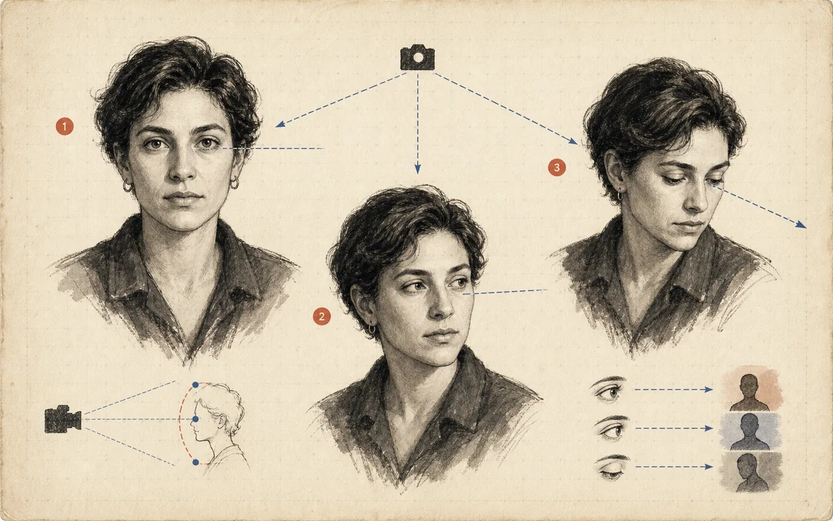 FIG.018Gaze in Three Directions Changes the CharacterLooking at the camera, looking away, and looking slightly upward each create trust, thoughtfulness, and a sense of the future, respectively.
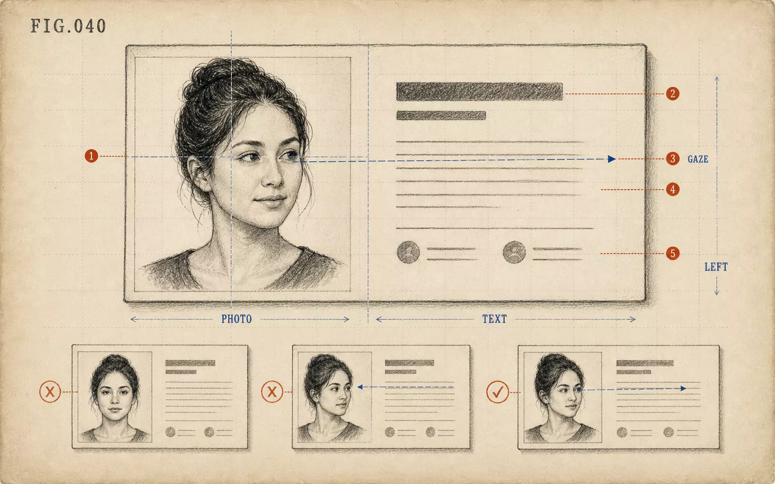 FIG.040On LinkedIn and Business Cards, the Face Goes on the "Left"On the web and on business cards, face photos tend to be placed on the left, making photos where the face is angled inward easier to use.
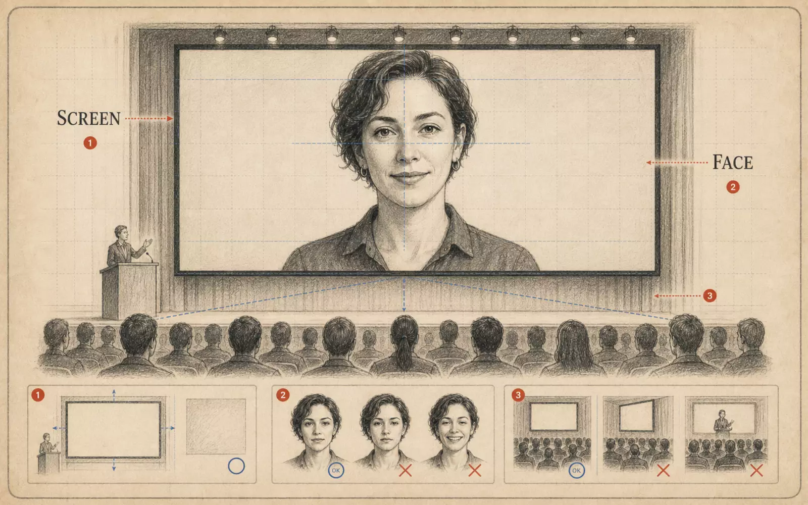 FIG.131Conference Speaker Portrait: How to Be Photographed as Someone Who Speaks on StageConference photos are seen small on announcement pages, imagined as the person on stage. Face direction and margin are key.